DESIGN TECHNOLOGY IN THE PRIMARY SCHOOL
Main menu:
COLOUR THEORY
ART LINKS
THE COLOUR CIRCLE AND COLOUR RELATIONSHIPS
A THEORETICAL UNDERSTANDING FOR TEACHERS
Artists and designers have an enormous range of techniques and media at their disposal to communicate ideas, and it is probably true to say that COLOUR forms a common feature that is always present.
Although successful design work and great works of art can be produced in Black and White, the addition of colour to a design or art form can often enhance and add visual impact that cannot be achieved in other ways.
It is difficult to imagine our world without any trace of colour, whether it is the natural panorama of the changing seasons, or the functional colour coding on the mass of wires and transistors in most electronic equipment.
Colour is both an art and a science, and a good understanding of its use is not only an asset to the designer, but can be an essential source of inspiration and a starting point for the teacher from which ideas may develop.
The textile designer may use a range of fabrics, with embroidery or weaving techniques and screen-printing dyes, while the potter uses subtle ceramic glazes and a variety of natural clays. An interior designer produces a composite arrangement of furniture, carpeting, wall coverings, and curtains, while the architect uses brick, stone, and a vast array of man made materials for decorative or structural purposes.
Whether there is an affinity towards painting or printmaking, textiles or fashion, furniture or ceramics, the work continually involves the use of colour and the theoretical terms associated with it.
The pigment or media may vary, but the actual understanding of colour mixing and its application in design situations is similar.
Before proceeding further, it would help to briefly describe the scientific approach. The physicist, basing his theories on the discoveries of Sir Isaac Newton (circa 1666) will describe how the colours we see are actually sunlight broken down into electro-magnetic waves. These waves can be seen more clearly by passing a beam of light through a prism, breaking the light into the colours of a rainbow.
Red, Orange, Yellow, Green, Blue, Indigo and Violet.
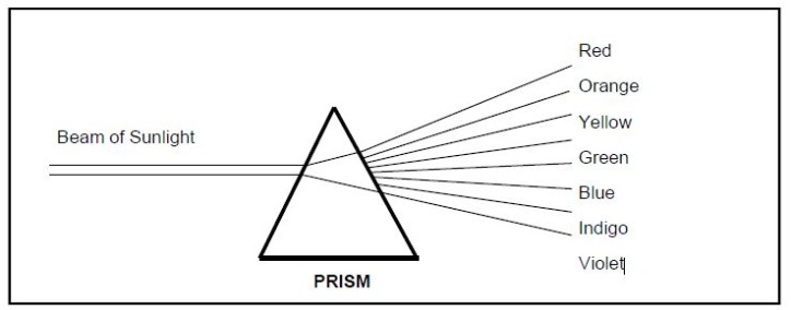
Due to Red and Violet having a natural closeness, Newton placed these seven colours in the form of a wheel, producing what was probably the first true COLOUR CIRCLE. It is from here that the theory relating to the use of colour can really begin.
An artist' s COLOUR CIRCLE consists of SIX main colours (missing out the Indigo) and SIX others, making twelve divisions in all.
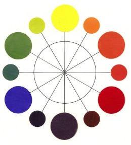
THE COLOUR CIRCLE and an alternative design
PRIMARY COLOURS
These are the most important group, RED, BLUE and YELLOW. They are pure HUES that can be mixed lighter or darker, but they cannot be produced by intermixing other colours.
Crimson Red, Lemon Yellow, Ultramarine Blue are three suggested primary hues that are suitable for experimentation with colour mixing.
Vermilion Red, Cadmium Yellow, Cobalt Blue are also primary hues that could also be used for experimentation with colour mixing but may not produce a good violet or orange.
SECONDARY COLOURS
These are GREEN, ORANGE, and VIOLET, hues that are produced by mixing two primary colours together in various proportions.
TERTIARY COLOURS
These are the six intermediate hues :-
Yellow - Orange, Red - Orange, Red - Violet, Violet - Blue, Blue - Green and Green - Yellow which exist between the primary and secondary hues.
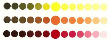
All colours have three main qualities :- HUE, CHROMA and TONE
HUE The twelve colours on the Artists colour circle are all hues. This term refers to the actual colour itself before any further additions have been made.
Thus:- Green + White, Green + Black, Green + Grey, Green + Red, Green + Brown, Green + Orange, would all be described as a range of green hues.
CHROMA This term refers to the amount of pure hue present in the colour and its relative strength and brilliance. i.e. Bright Green, Medium Green, Grey Green, Dull Green, describing the changes In brightness and purity.
TONE or TONAL VALUE
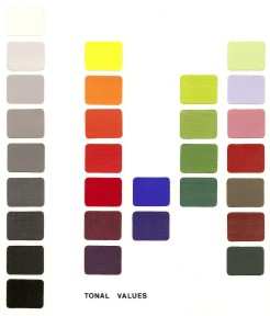
The third quality refers to the lightness or darkness of a colour, and its changed appearance due to adding another colour, Black, White, or Grey. In Black and White photography the artist would describe the tones of Grey in a print, and the tones of a colour circle can easily be thought of as a similar scale of Greys ranging from Black at the base to White at the top.
Yellow must be set against the lightest Grey and Blue-Violet against the darkest, with no true hue lying directly opposite either the White or Black. Colours added to White ( Tints ) are obviously made lighter in tone and by adding Black ( Shades ) the tonal values are darkened. The term TONE can therefore be used to describe any colour variation of a pure hue.
These three colour qualities can be affected by many different circumstances .
- Light Supply. Colours will look paler in early morning light than at mid-day or dusk. They will also look different in natural daylight compared to Interior lighting conditions.
- Surroundings. (other colours) It is impossible to isolate a colour from its background. and varying effects of contrast, harmony, discord will occur.
- Distance. Colours in a landscape appear muted and paler in the distance while those nearby are brighter.
- Atmosphere. The colours we observe are visually affected by fog, rain, snow and general weather conditions.
- Surface Texture. The roughness of the surface that is underneath a colour can create various optical effects.
TINTS AND SHADES
As mentioned in an earlier paragraph the addition of White to a colour will produce a range of TINTS or paler delicate colours. ( e.g. Tints of autumn sunshine ). SHADES can be produced by adding Black to a colour to produce darker variations. ( e.g. Shades of night are falling ).
Ultramarine Blue is often added to intensify and add depth to an otherwise dead Black. Adding Black to Yellow will produce a soft Olive Green range.
PASTEL SHADES
The lighter tints are sometimes referred to as pastel colours, popular in home decorating, but it is more accurate to describe pastel shades as Hues mixed with Grey rather than White.
BROWN NEUTRALS
The colour Brown can be mixed in a variety of ways including Red + Black, and Orange + Black. However if all three Primary Hues are added together in any proportions some type of Brown Neutral will be produced.
E.g. Examples of Secondary Hues which, when mixed, will produce browns.
Orange (Y+R )+ Green (Y+B), Green (Y+B) + Violet (B+R), Violet (B+R) + Orange (Y+R).
E.g. Examples of Complementary Colours which, when mixed, will produce browns.
Orange (Y+R) + Blue, Green (Y+B) + Red, Violet (B+R) + Yellow.
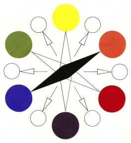
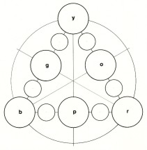
COMPLEMENTARY COLOURS
This term refers to an arrangement of colours that lie directly opposite each other on the Colour Circle. ( R to G, Y to V, B to O. ) They clash and obtain maximum colour contrast, but may also appear unpleasant together if not used with care. In a design that uses a large amount of one colour ( Monochrome effect ) it is often possible to create centres of interest by introducing a Complementary Colour into the arrangement.
It is incorrect to say that two particular colours should never be used together, because under the right circumstances they could be used to advantage to create a particular effect In a design or piece of art work.
COLOUR HARMONY
The simplest form of Colour Harmony is produced by using several tonal variations of one colour or hue. This is a MONOCHROME effect that relies on the contrast of separate light, dark and medium tones.
ORANGE + R + Y, GREEN + B + Y, VIOLET + R + B
Another form of harmony relies on using two ADJACENT or ANALOGOUS colours that lie next to each other in the Colour Circle. The whole theme of harmony is to produce en arrangement of colours that appear attractive or aesthetically pleasing to the eye.
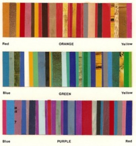
In order to be most successful a designer could use three adjacent colours from the circle and as long as these included one Secondary and the two Primary colours used to mix it, then Harmony would be present. Through experience it will be found that White, Black, and Grey will harmonise with most colour schemes.
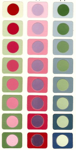
COLOUR DISCORD
The normal tonal order of the Colour Circle is that Yellow is the lightest colour and Violet the darkest. Reverse this, make the Yellow darker and the Violet light, and a discordant colour range is produced. Discords can look visually distasteful and often clash violently. ( Imagine a room with one pink wall and the others pale green.) If the colours are equal in tone they produce a flat effect where the colours tend to merge into each other with no tonal contrast.
In rows A and C the ends of the rows contrast, dark against light, while the central colours are discordant. In row B All of the central circles and background colours are discords, or of equal tone.
All colours on the Colour Circle can be made to discord with each other, even if they normally harmonise. Thus if Red is mixed to a light Pink, it will not only discord with Orange, but also with all the other natural Hues in the Circle. The most disturbing effects occur however when several equally toned colours are used together. Even if one of these is a natural tone, all the rest will be discordant.
COLOUR TEMPERATURE
Red and Orange are visually warm colours, Blue and Green are visually cold. Violet and Yellow can be either warm or cold depending upon the arrangement surrounding them. Warm colours tend to advance or come towards the viewer while cold colours recede and give a sense of depth to a design.
COLOUR THEORY - EXPERIMENTAL DESIGN PROJECTS
These projects are designed to give experience of Colour mixing and blending using a good quality gouache or poster colour paint. It is important to use these as an opaque medium, and choose only the Primary Hues suggested in the text. If gouache is not available, coloured crayons or felt tipped pens could be used, but these may not be as successful.
Some colours should be avoided for mixing the actual Colour Circle (Turquoise, Yellow Ochre, Primrose, Cyclamen as these may produce fugitive results. These same colours however may be used deliberately in other experiments to create some particularly useful effects. Although good results may be achieved by ignoring all rules of colour theory, until a sound knowledge is built up through experience and experimentation, it will be better to use only simple tonal colour schemes and colour harmony.
Try constructing a Colour Circle using drawing instruments, and by intermixing the three main Primary Hues, paint the twelve hues in their correct sequential position.
Create a design using one main geometrical shape surrounded by similar small shapes. The same shape should be painted in a secondary colour with the other shapes in various tints, shades and tones that create colour harmony.
This project may also be suitable for producing a collage design using coloured magazine cuttings carefully selected and glued In place.